Overview
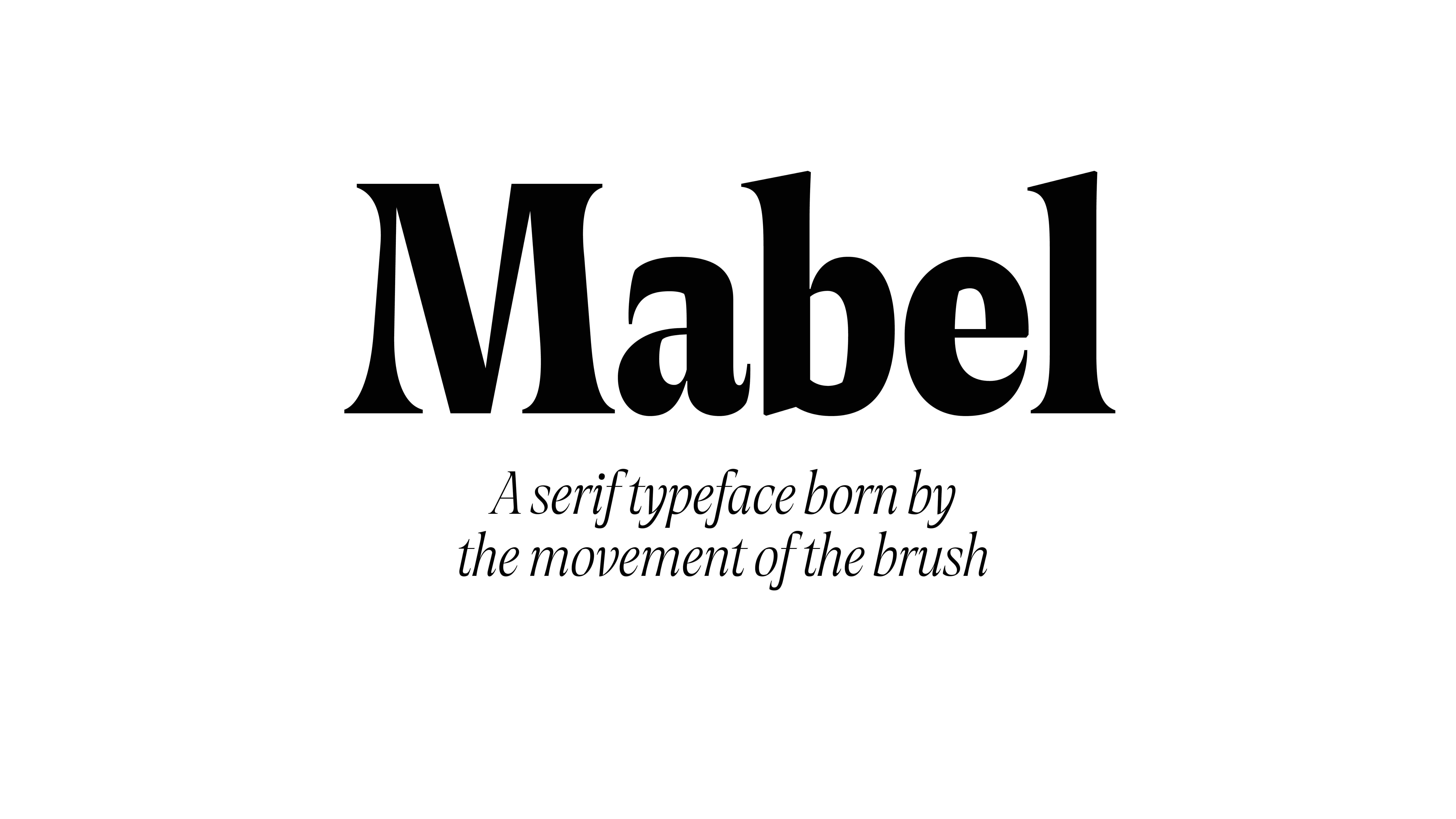
Mabel takes its inspiration from letterforms found on a Dwiggins Book cover from 1937.
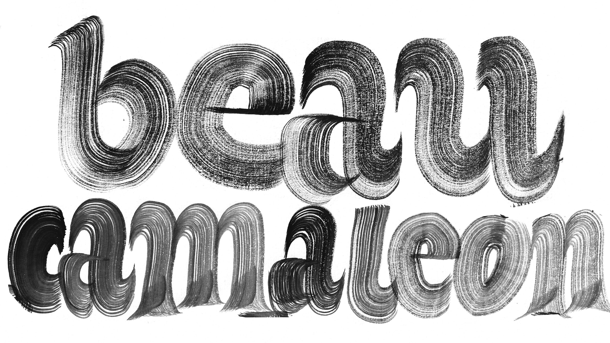
The interplay between vertical stress and the softness of the hand-drawn details gave the text a dynamic and expressive texture that immediately caught our attention.
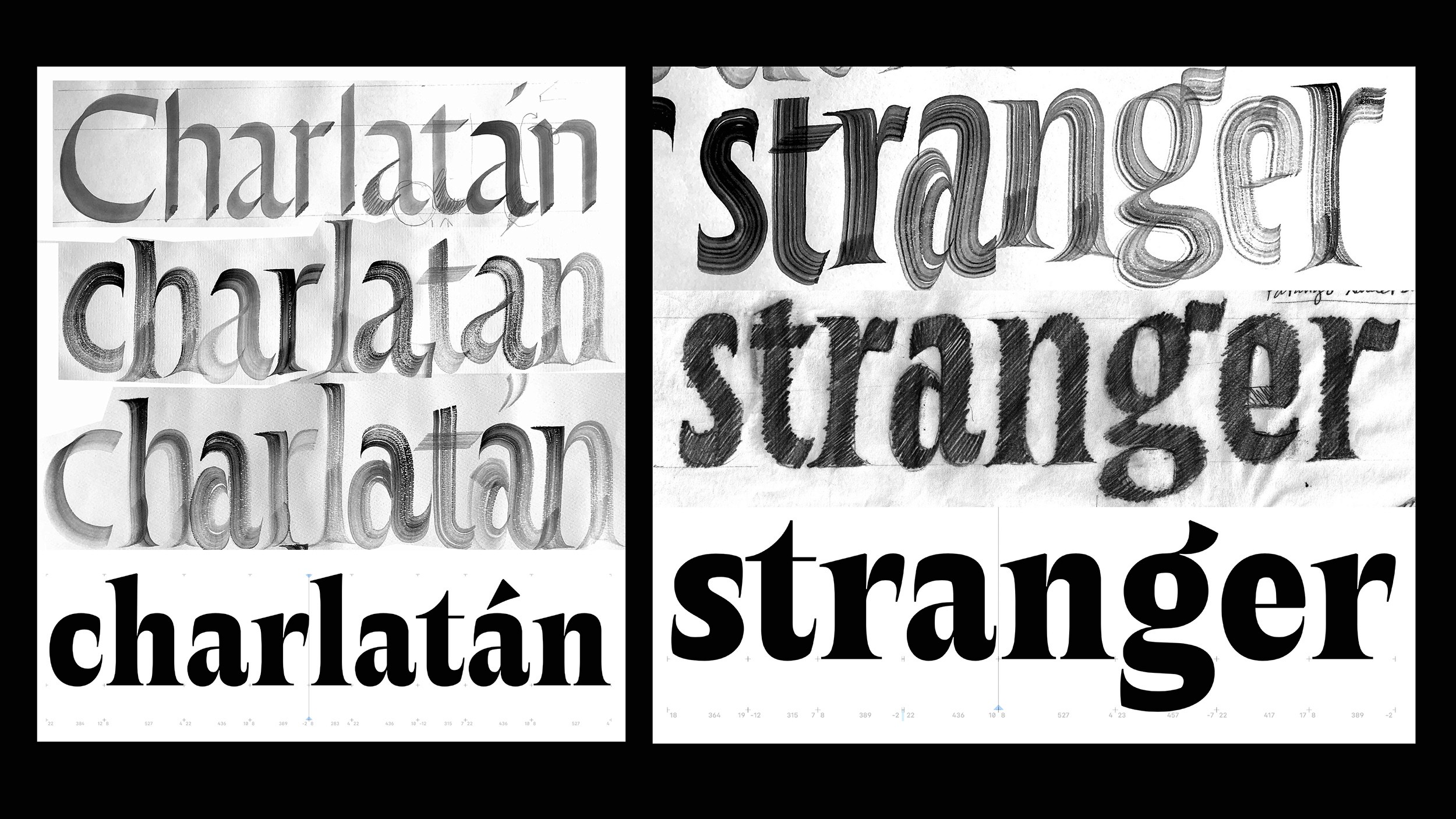
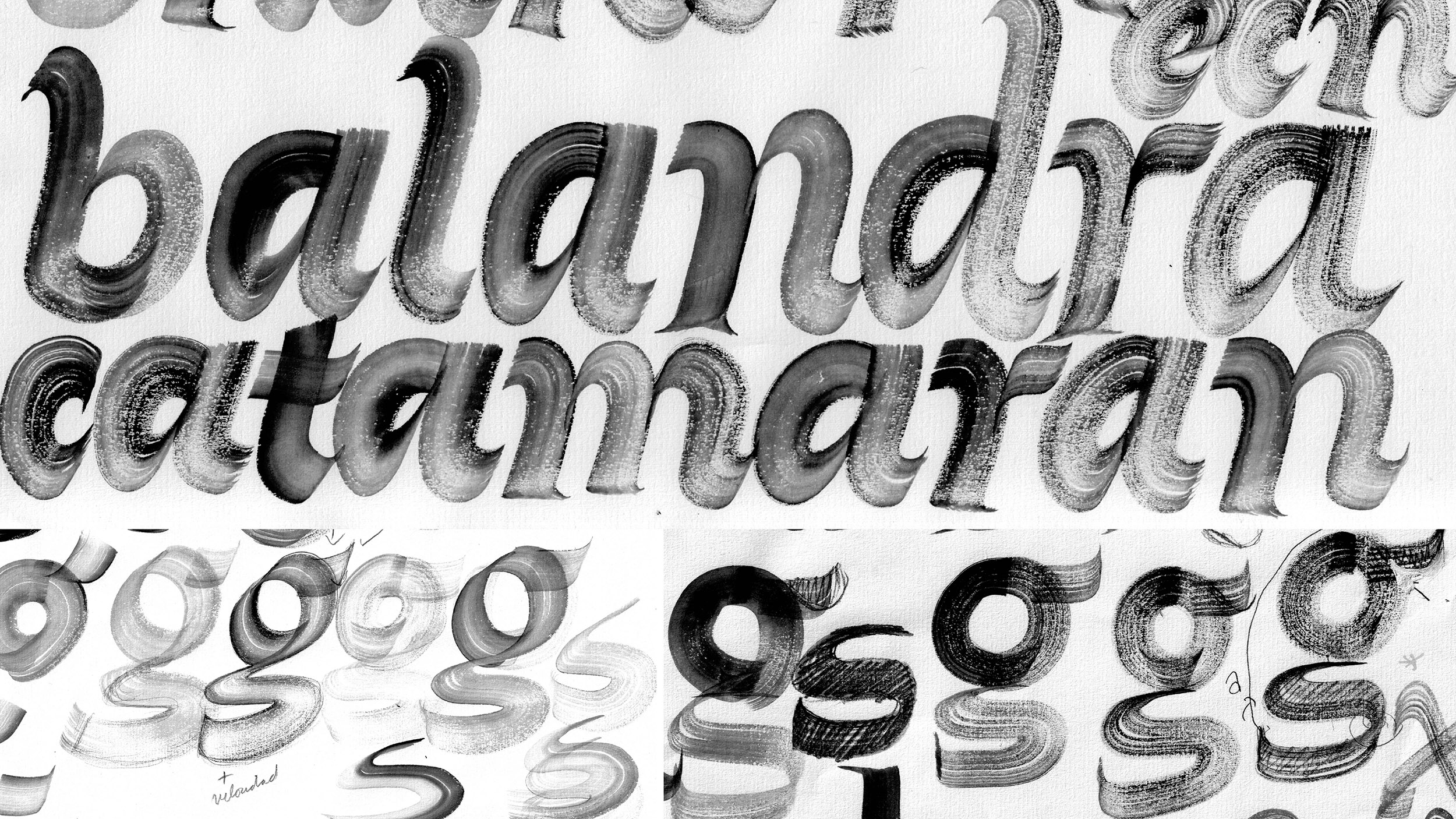
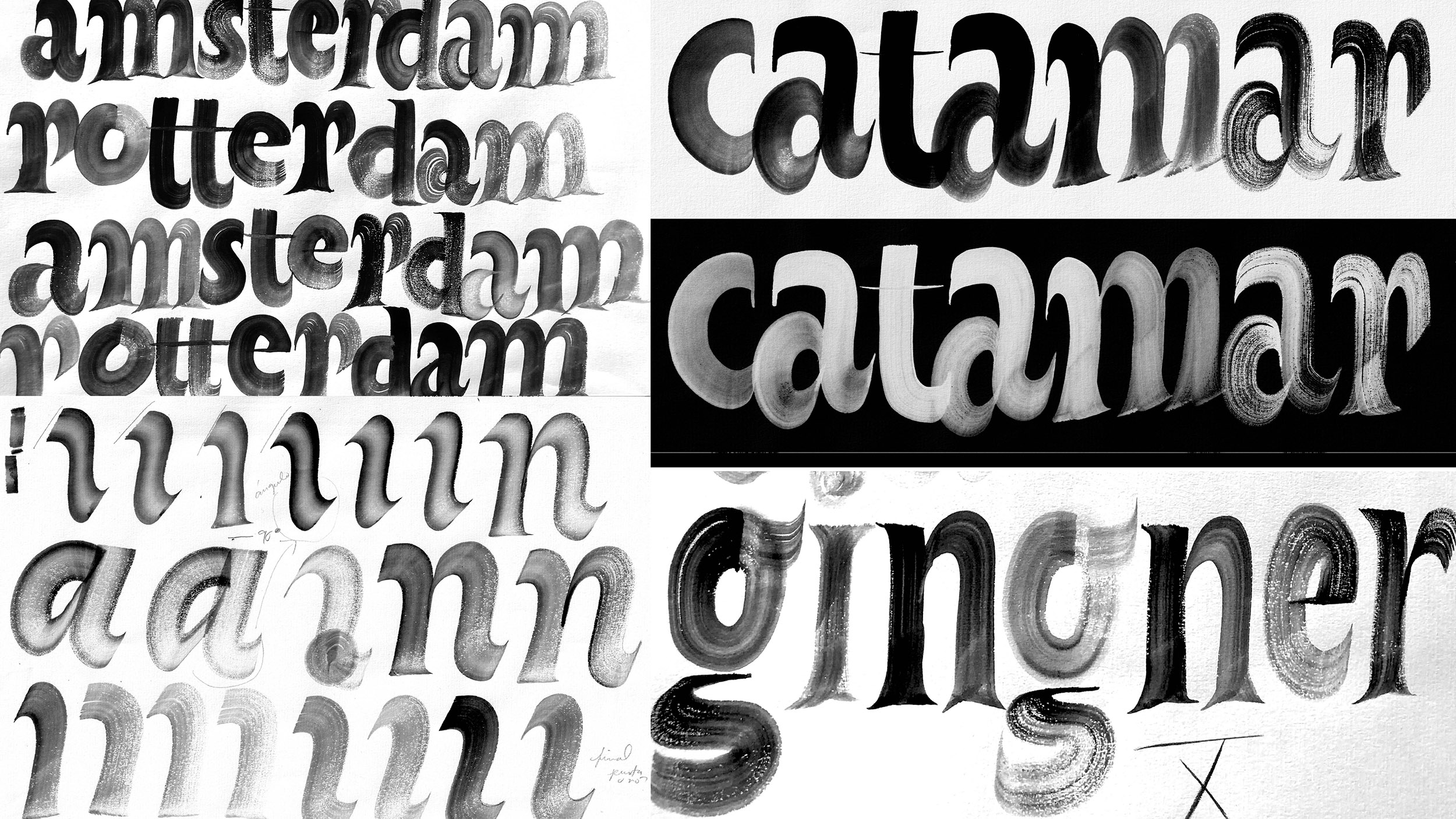
During the design process Sabina and I engaged in a calligraphic study using a broad brush, reinterpreting the shapes by varying the rotation angle. This approach introduced sharp angles alongside soft terminals, creating a unique visual rhythm.
[Client]
Retail Typeface
[info]
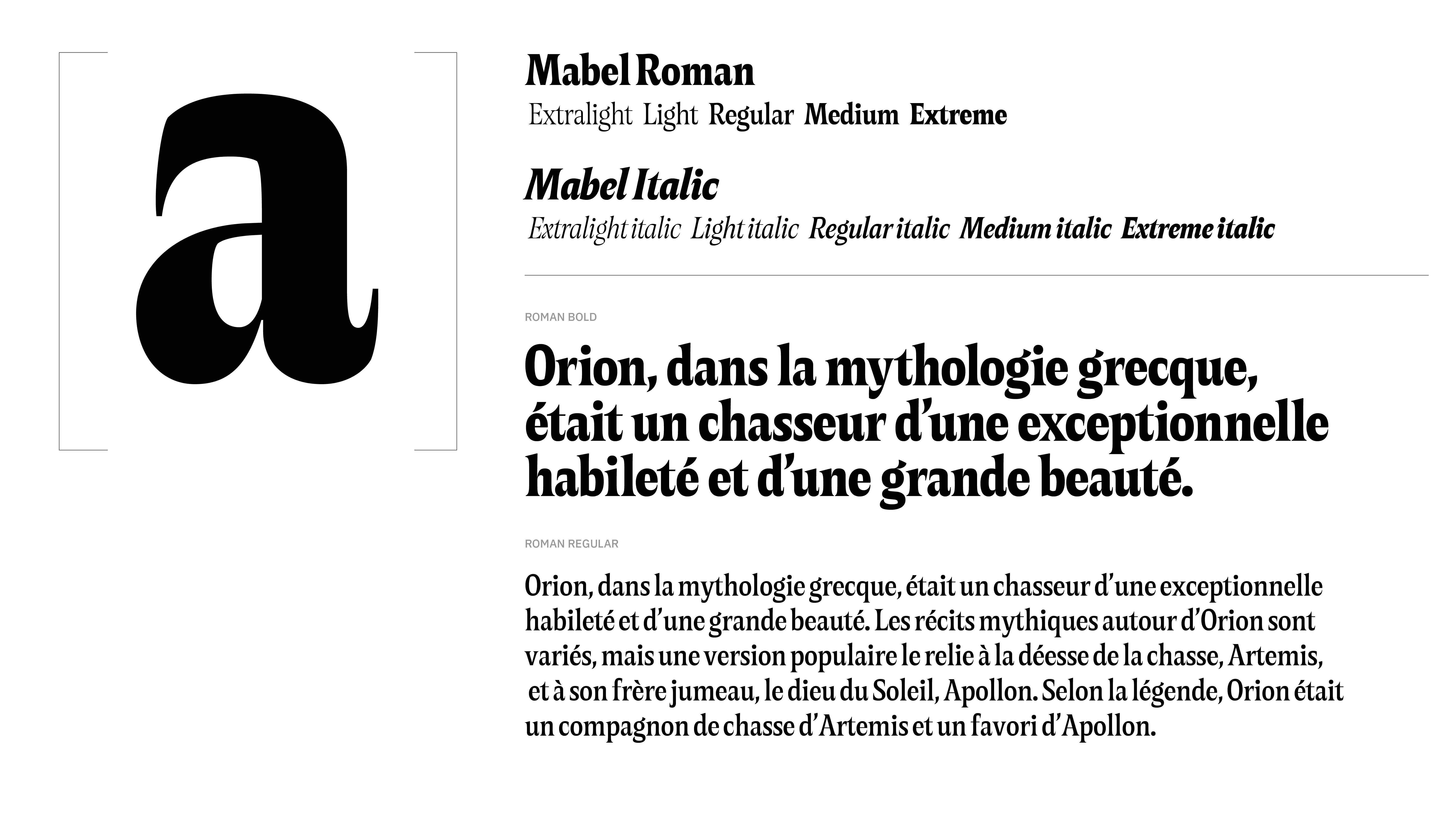
Styles: Roman and italic
Weights: 5 weights
Character set: 494 Glyphs
Project in collaboration with Sabina Chipară.
[Service]
Type Design
[Year]
2025


Next Project

GALLOBÚHO
2024