
Overview
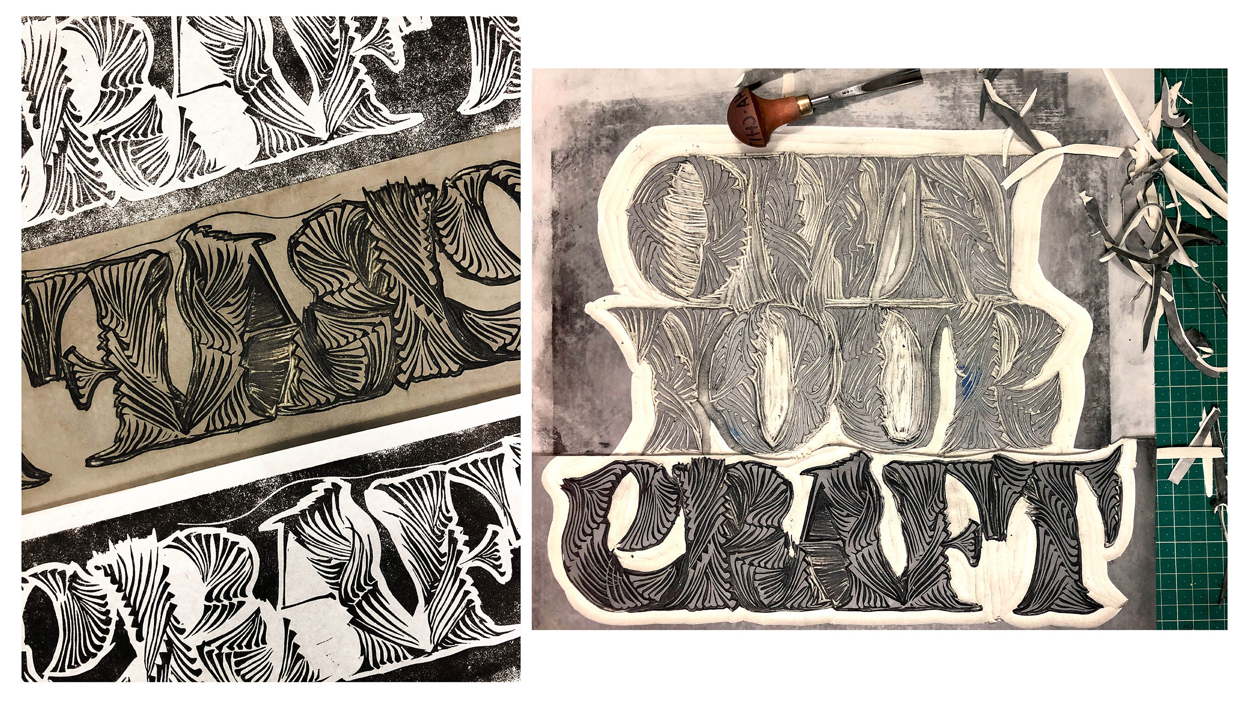
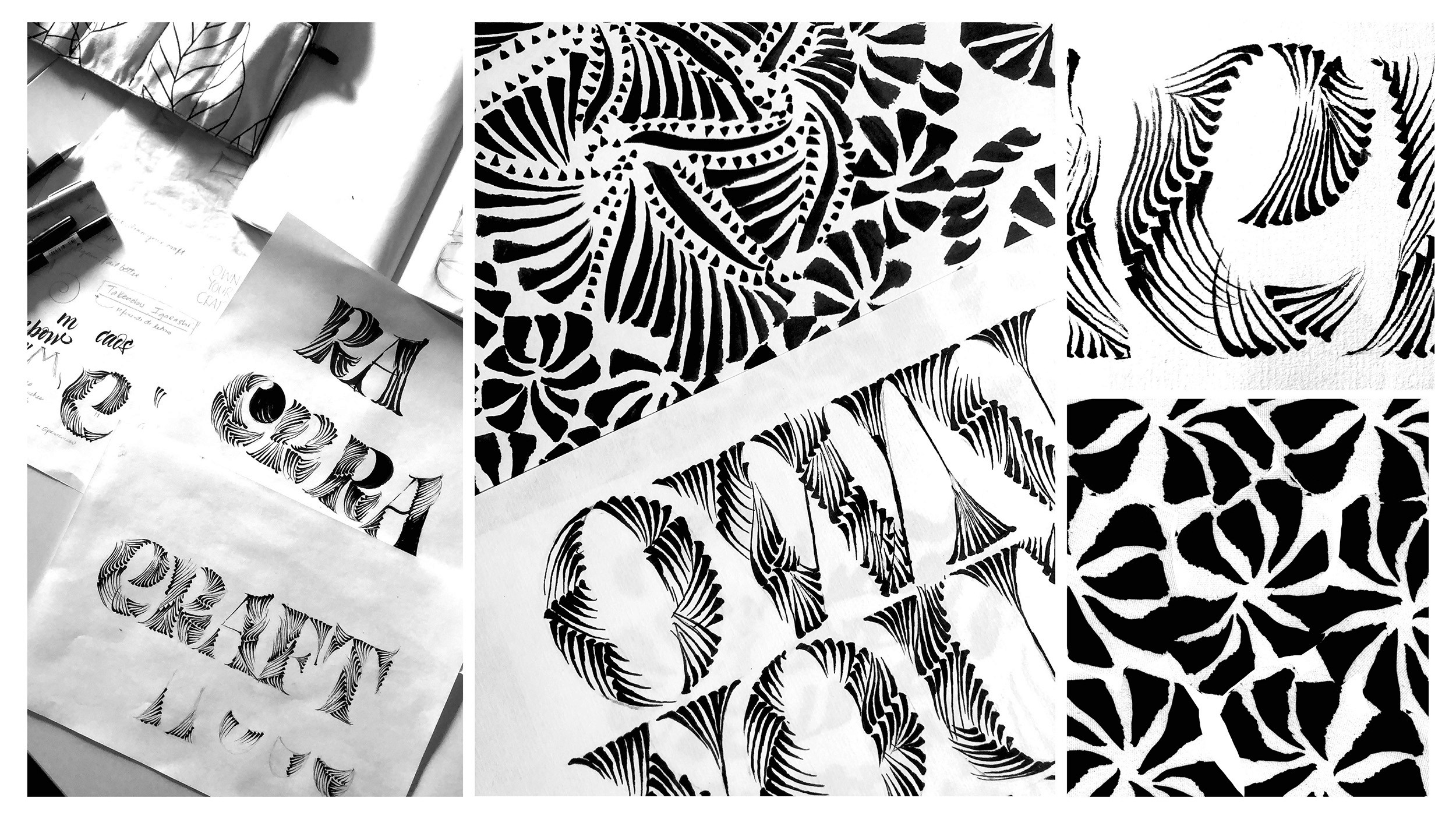
Lettering and engraving inspired by patterns found in barro negro crafts from Oaxaca, as well as textures from engraving techniques.
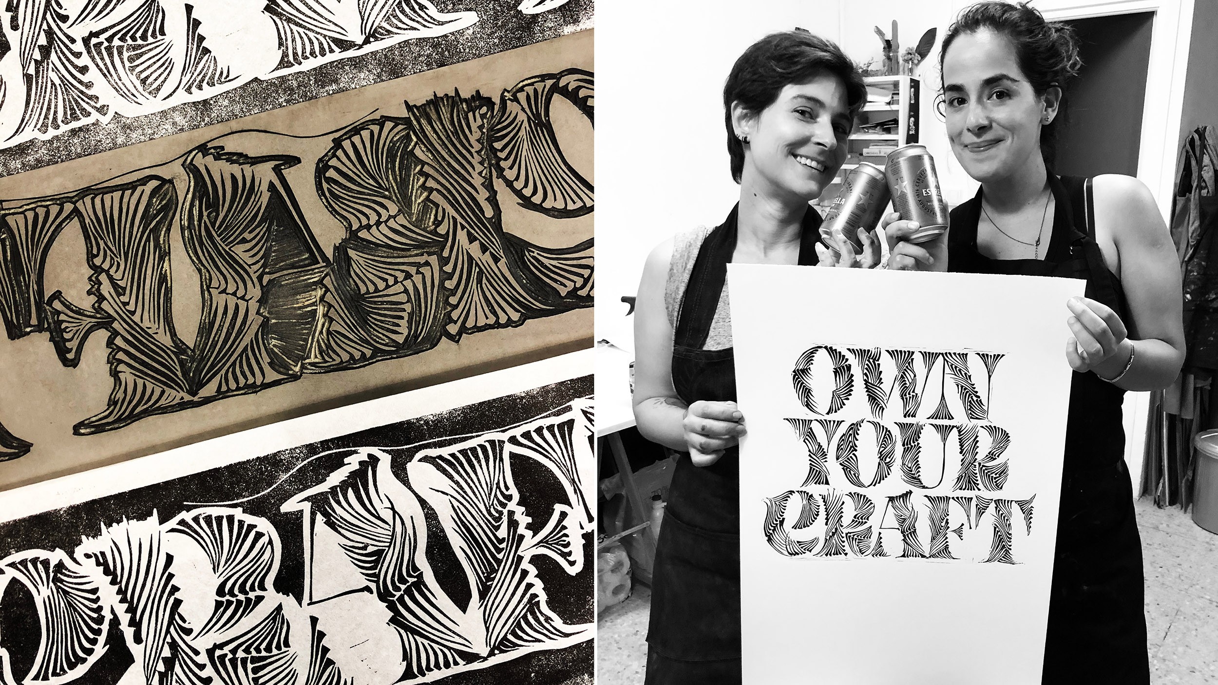
I made several illustrations and experiments. The original piece was created by hand with a small brush, and later we produced a linoleum print at poster size.
A project in collaboration with my dear friend Juliana Vélez.
[Client]
Self initiated
[info]
Prints available for sale in A4
Project in collaboration with Juliana Vélez
[Service]
Custom Lettering and engraving
[Year]
2025


Next Project

Calligraphy
2025